Associated Logistics Group
A branding project

To shape ALG's logo, I first studied how top logistics companies - including Coyote Logistics, DHL, and Echo Global Logistics - approached their branding. Many competitors leaned heavily on aggressive reds, greens, or oranges to convey speed and scale. I wanted ALG to feel different: calm, confident, and approachable.
That's where the blue-and-gold color scheme came in.
The logo itself uses clean geometric forms that balance structure and motion - a subtle nod to movement, precision, and efficiency in logistics.
Together, the palette signals both quality and approachability - helping ALG project the experience of a large-scale logistics firm without losing the personal touch that sets them apart.

The ALG website was designed as both a digital home and a practical tool. It gives prospective clients a clear sense of who ALG is, while offering current customers a secure portal to manage their shipments and access personalized services.
Visually, the site carries through the blue and gold palette to maintain brand consistency and evoke trust from the moment users arrive. The layout is intentionally clean, with clear calls to action and quick access to key information about services, company values, and history.
Behind the scenes, SEO best practices were implemented to boost visibility and drive new business leads. The end result is a site that looks modern, performs well, and supports ALG's long-term growth.
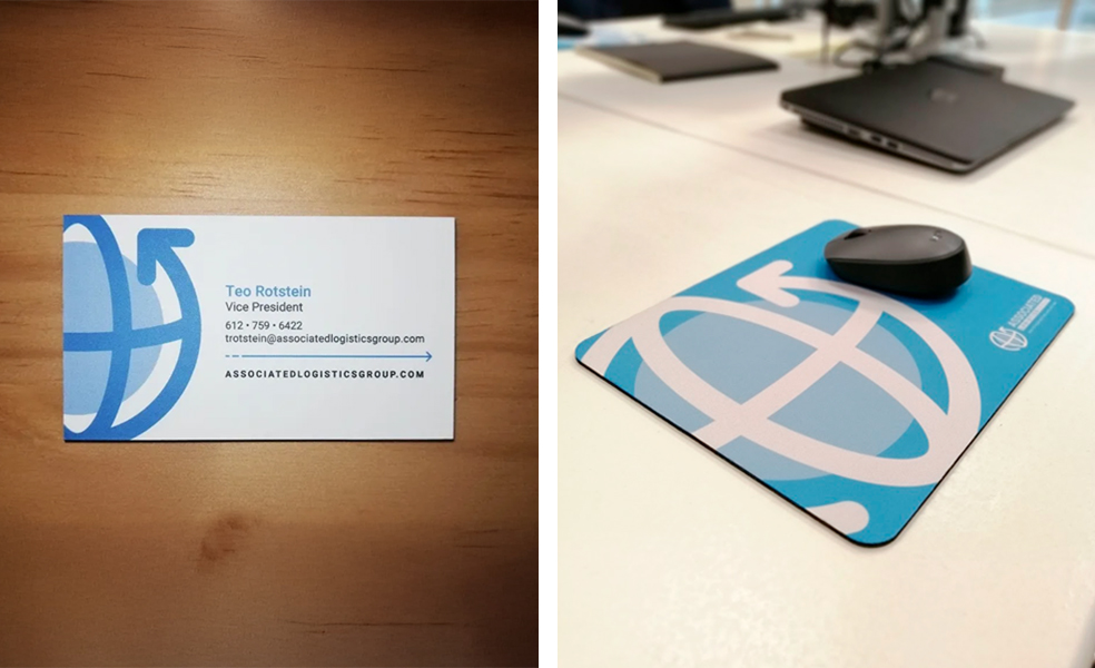
A strong brand extends beyond screens - it shows up in every interaction. I designed a full set of stationery and branded materials that carry ALG's identity through to everyday touchpoints.
This included:
Each piece was designed to reflect the same care and reliability that ALG delivers to its customers - turning even small items into meaningful brand experiences.
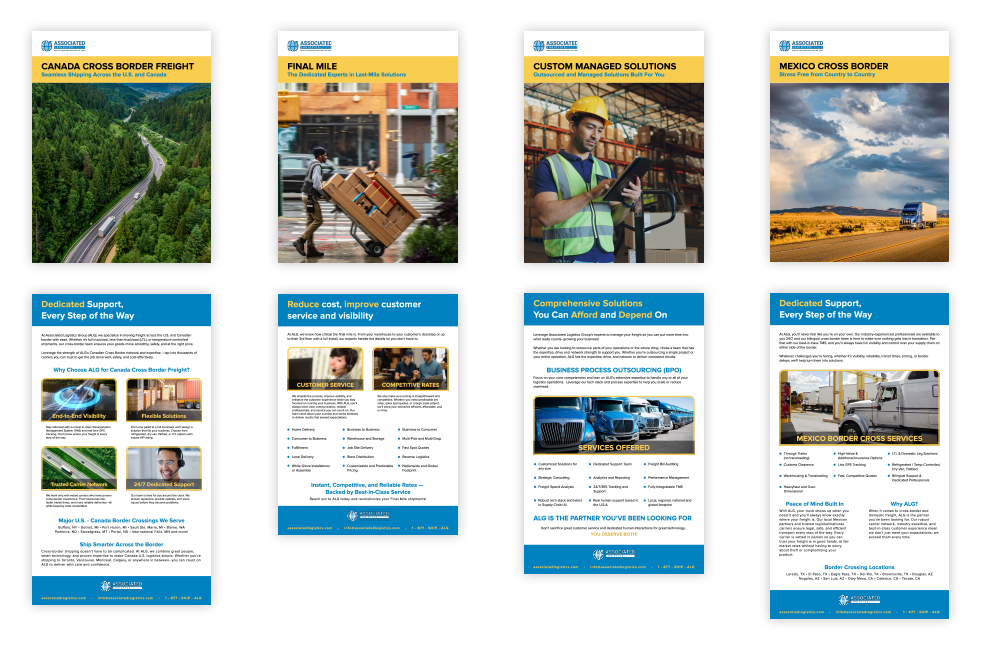
In addition to core brand and web materials, I designed a series of digital sell sheets to support ALG's sales and marketing teams. These one-page assets communicate key service offerings - like Canada Cross Border Freight, LTL Shipping, and Expedited Services - in a clear, visually engaging format optimized for both print and digital distribution.
Each sell sheet follows the same visual rhythm: consistent margins, typography, and blue-and-gold color balance that instantly identifies it as part of the ALG brand. This consistency helps reinforce brand trust while keeping every touchpoint aligned - whether viewed as a PDF attachment, printed handout, or sales deck slide.
Because larger design overhauls often meet some hesitancy from leadership, I use these smaller projects as opportunities to evolve the brand subtly. Each new sell sheet introduces small refinements - like improved hierarchy, cleaner icons, or more dynamic layouts - that gradually modernize ALG's visual direction without disrupting what's already familiar to the team.
This approach allows me to “sprinkle in small wins” that move the brand forward piece by piece, building momentum for larger changes over time.

Not necessarily interior design but I got to design their receptionist area.